Peer-Tutor Connect
A peer tutoring platform where students help each other with coursework through course-specific discussion forums.
Project Foundation
Students in online courses hit learning blockers at terrible times. 11 PM on a Saturday night, the assignment is due Sunday, and the concept just will not click. They try emailing the professor, knowing the reply will not come until Monday or Tuesday. They check Canvas messages, hoping someone saw their post, but responses take a day or two if they are lucky. Office hours are three days away. Meanwhile, other students in the same class have already figured out that exact concept and are awake right now. They could explain it in a couple of minutes because they just learned it themselves. But there is no easy way to reach them.
Peer-Tutor Connect is a web application that connects those students through course-specific discussion forums. When you log in, forums for your enrolled courses show up automatically. You can browse existing questions to find solutions that helped other students with similar problems, or post your own and get answers from classmates in threaded conversations. Helpful responses can be marked and questions resolved once the issue is sorted out. Anonymous posting is available for anyone who feels uncomfortable asking questions publicly.
Understanding the User

Aditi Sharma
20 · Computer Science Sophomore · Part-time remote job (15 hours/week)
“I wish I could get answers late at night when I actually need them!”
Aditi is a 20-year-old sophomore majoring in Computer Science at a large public university. She lives off campus in an apartment and works a part-time remote job to support herself. Balancing work and coursework means she primarily studies late at night and on weekends when her schedule allows.
She faces occasional learning blockers in programming and computer science concepts, which interrupt her study flow and leave her feeling stuck. She values collaborative learning and believes peer explanations are often more relatable than formal textbook definitions, as peers recently navigated the same learning curve.
- Prefers fast clarification over waiting for instructor responses
- Most serious study sessions happen during evening hours and weekends
- Values collaborative learning and peer explanations
- Comfortable with digital tools and has reliable internet access
- Cannot easily attend on-campus tutoring or office hours due to living off campus and working part-time
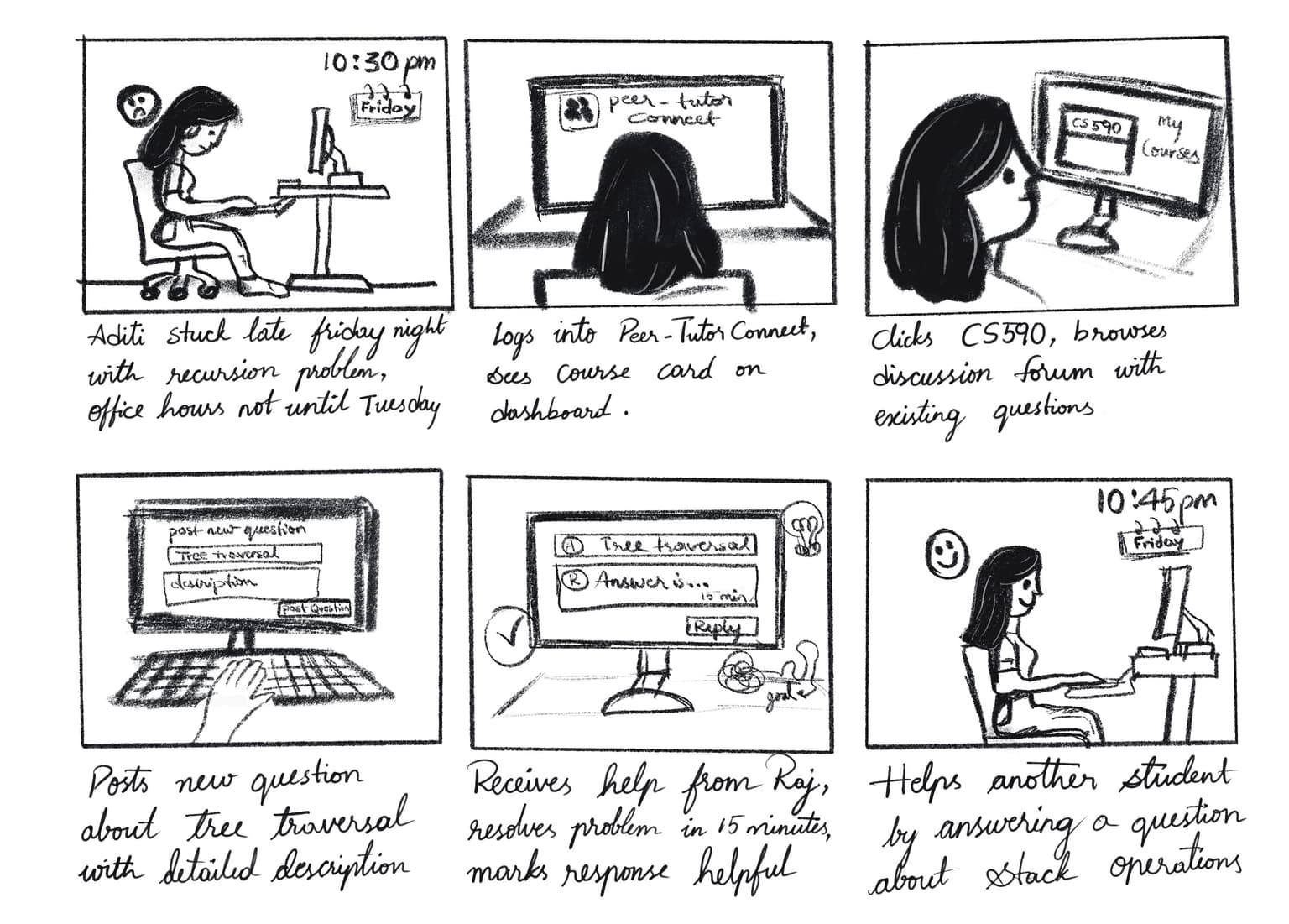
The storyboard captures the key steps from encountering a learning blocker to getting help quickly and then helping others. It shows the complete user flow through our platform.
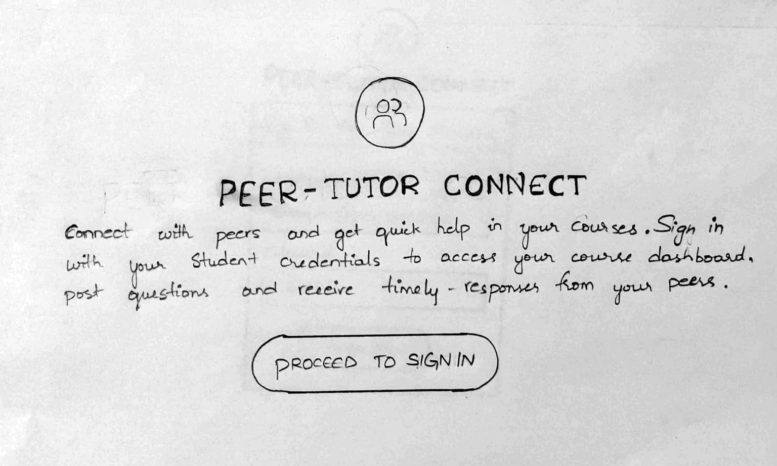
Low Fidelity: Paper Prototype
Showing image 1 of 6
Our paper prototype consisted of hand-drawn pages for each major screen: landing page, sign in, course dashboard, question list, post question form, and question details with responses. During testing, we acted as the computer by physically swapping out paper screens when users navigated between pages. The goal was to test whether the navigation made sense and if users could complete basic tasks like finding a course, posting a question, and reading responses before investing time building anything digitally.
User Feedback
Tested with 3 users- All 3 users completed the entire navigation without getting confused about the flow
- Users liked the overall idea and found it useful for getting peer help
- No clear purpose for having both a landing page and a separate sign in page when they could be merged into one
- 1 user suggested adding a help or guide button to assist with navigating the platform
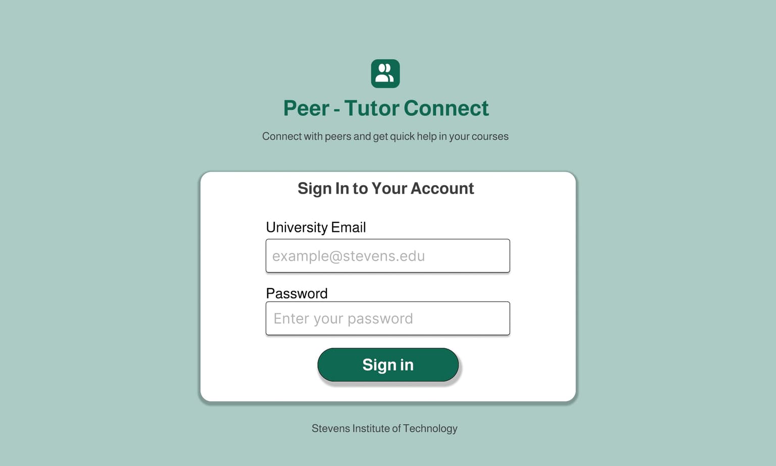
Medium Fidelity: Figma Prototype
Showing image 1 of 7
Based on paper prototype feedback, we merged the landing and sign in pages into a single page to eliminate redundant clicks and added a help widget to guide users through the platform. We built all the screens in Figma and linked them together so users could navigate just like they would in the real application.
Key Changes
- Merged landing and sign in pages into one to eliminate redundant clicks
- Added a help widget to guide users through the platform
User Feedback
Tested with 3 users- Users really liked the overall design and found the interface clean and easy to navigate
- All users completed tasks successfully with minimal additional feedback
- 2 users suggested adding search, filter, and sorting options to help quickly find relevant questions
- These 3 users had already tested twice and were too familiar to give fresh perspective, so we decided to recruit different users for high fidelity testing
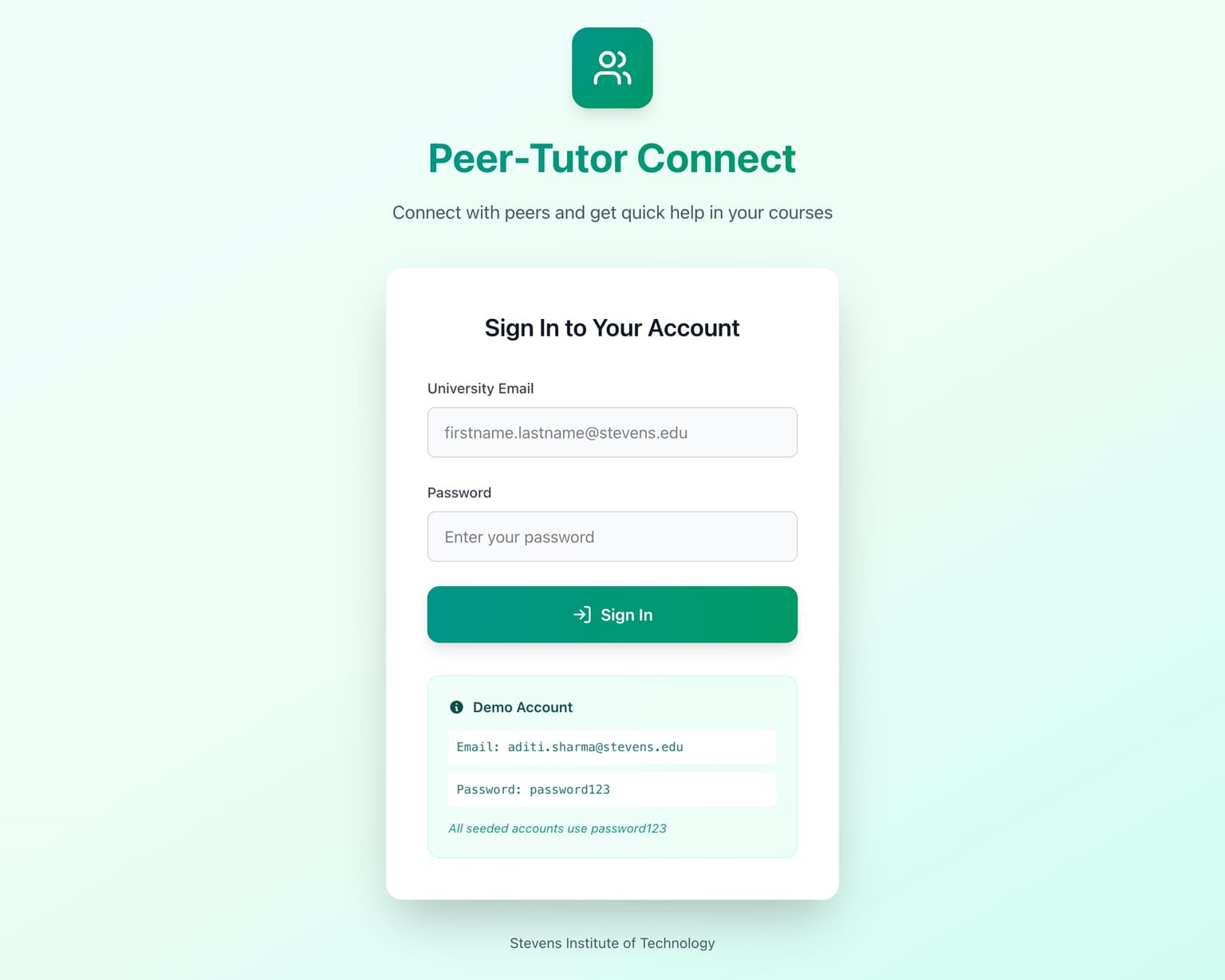
High Fidelity Prototypes
Showing image 1 of 10
Our first high fidelity prototype was a fully functional web application built with React, Express, and MongoDB. The main improvements from the medium fidelity prototype were adding search, filter, and sort capabilities so students could quickly find relevant discussions, along with a polished and responsive UI that works across all device sizes. We tested with 10 new users organized as 5 pairs, with one asker and one answerer per pair.
Key Changes
- Added search, filter, and sort for questions based on medium fidelity feedback
- Built fully functional web application with React, Express, and MongoDB
- Polished responsive UI across all device sizes
User Feedback
Tested with 10 users- 4 users stated the platform was already very good with no specific suggestions for improvement
- Users appreciated the overall concept and functionality
- Help guide only covered asking questions but did not explain how to reply or other features
- Post question form text fields were too large and required scrolling to reach submit, form should fit on one page
- Buttons on question detail page were large and visually distracting, helpful answers needed better visual distinction
- Question and reply view needed to be more compact to show more content without excessive scrolling
Design Rationale
We chose Nielsen's 10 Usability Heuristics because they are well-established and cover exactly what we needed to evaluate for a student-facing platform. We went through each heuristic systematically during development to make sure we were not missing anything that would slow students down or confuse them.
Visibility of System Status: Toast notifications provide immediate feedback for every action. Loading spinners appear during data processing. The notification bell shows a red breathing badge when new activity occurs.
Match Between System and Real World: The discussion forum layout mirrors platforms students already know. Uses natural language and familiar course codes like "CS545" that students recognize from their schedules.
User Control and Freedom: Students can edit or delete their own questions and responses, toggle anonymous posting on or off, navigate back using breadcrumbs, and undo mistakes by editing content immediately.
Consistency and Standards: Same button styles, card layouts, color scheme, and wording throughout. Works identically on desktop and mobile with proper hover states and focus indicators on all interactive elements.
Error Prevention: Form validation prevents errors before they happen with immediate feedback on required fields and real-time character counts for titles (200 max) and content (2000 for questions, 1500 for responses). Destructive actions like deleting content require confirmation.
Recognition Rather Than Recall: Breadcrumb navigation shows exactly where you are. Course cards display on the main dashboard so students do not need to remember course IDs. The help widget is always visible and green "Answered" badges make status recognizable at a glance.
Flexibility and Efficiency of Use: Power users can submit responses with Ctrl+Enter instead of clicking. Multiple paths to content through browsing, filters, or search. New question count badges help answerers see where help is needed without clicking through each course.
Aesthetic and Minimalist Design: Each page shows only relevant information with no clutter. Course dashboards show questions, question pages show responses. Clear information hierarchy with proper spacing.
Help Users Recover From Errors: Error messages are specific and actionable like "Title is required" instead of generic "Invalid input." Toast notifications appear immediately. Users can recover by editing incorrect content.
Help and Documentation: A floating help widget in the bottom right corner of every page provides guidance without requiring users to leave the page. Most users never needed it because the interface was intuitive enough.
Peer-Tutor Connect successfully meets all 10 of Nielsen's Usability Heuristics.
Results
When we hit all our targets in iteration 1, we thought we were done. The numbers looked great. But iteration 3 showed us what real efficiency improvement looks like. That 71% drop in time to first response came from those dashboard badges letting answerers see exactly where help was needed without clicking through every course. We did not just meet efficiency targets on paper. We made the actual experience of getting help genuinely faster and less frustrating. From every measurable angle, the metrics, the feedback, the user satisfaction, we improved efficiency for our target population.
| Metric | Iter 1 | Iter 2 | Iter 3 | Improvement |
|---|---|---|---|---|
| Time to First Response | 284.6s | 262.6s | 81.25s | 71% |
| Time to Resolution | 546.6s | 604.6s | 376.0s | 31% |
| Exchanges per Question | 3.0 | 2.6 | 2.5 | 17% |
| User Satisfaction | 3.63 | 3.85 | 3.8975 | 7% |
Reflection
The biggest lesson from this project was that hitting your targets early does not mean you are done. We met all our efficiency metrics in iteration 1, but the real improvements came from listening to what users actually struggled with in iterations 2 and 3. Small changes like dashboard badges and a reset filters button had a bigger impact on the experience than we expected.
Each iteration taught us something different. Paper prototyping showed us that familiar patterns work and that redundant pages frustrate users. The Figma prototype confirmed our direction and revealed the need for search and filtering. High fidelity testing with real users exposed interface issues we never would have caught on our own. Going from 4 out of 10 users satisfied in iteration 1 to 6 out of 8 in iteration 3 proved that iterative design actually works when you take feedback seriously.
We built something that solves a real problem students deal with every single day. The feedback throughout all our iterations showed us that students genuinely want this kind of peer support system. They found it useful, they found it efficient, and they appreciated having a way to get help during those late-night study sessions when nobody else is available.
Huge thanks to all 31 users who tested our platform across 5 design iterations and gave us the valuable feedback that made Peer-Tutor Connect what it is today.

I am currently seeking full-time opportunities in UX Design, Product Design, Front-End Development, and Full-Stack Development. Whether you want to discuss opportunities or just say hello, feel free to contact me.